The integration of medical services within fire and rescue operations is a critical aspect of emergency response. As members of the community and emergency personnel, understanding the symbols that represent these services enhances communication and awareness during critical moments. This article explores the intersections of fire and rescue services with medical symbolism, illustrating how these symbols are employed, their significance, and the necessity for clear representation in emergency situations. Each chapter delves into distinct facets of this relationship, providing a holistic view that supports firefighters, educators, and community residents alike.
Interpreting Fire and Rescue Through Medical Symbols: A Unified Classification for Practice
When people speak of medical symbols in the realm of fire and rescue, they are really talking about a shared language that helps strangers and responders alike move with speed, clarity, and trust during chaotic moments. The ecosystem of emergency response blends two distinct yet overlapping vocabularies: the language of firefighting and rescue, and the language of medical urgency. Classifying these symbols is less about inventing new icons and more about aligning existing emblems with the practical realities of on scene care, transport, and hospital handoff. The result is a narrative where the fire station remains the hub of rapid response, while the Star of Life becomes the recognizable beacon when care becomes the central task. In this sense, there is no single medical symbol that represents fire and rescue as a stand-alone service. What exists, instead, is a framework in which the primary emblem for medical emergencies—the Star of Life—serves as a universal touchstone, complemented by era-specific logos, color codes, and contextual signage that signal priority, capability, and stage of care. This layered approach reflects the realities of mixed-response teams where firefighters may also function as first responders delivering prehospital care, awaiting a seamless handoff to hospital teams.
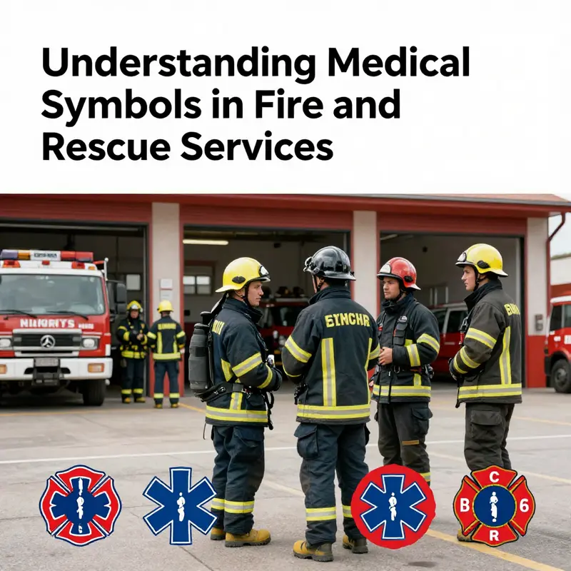
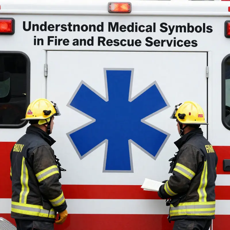
At the heart of the matter lies the Star of Life, a blue six-pointed star that has become the official symbol of prehospital emergency medical services in many parts of the world. Its six points are not decorative fragments but a deliberate map of the EMS lifecycle: Detection, Reporting, Response, On-Scene Care, Care in Transit, and Facility Care. This sequence encapsulates the mission of EMS in a way that transcends language, enabling a patient to receive coherent care from the moment danger is identified until the patient reaches the hospital door. When fire and rescue teams are activated to a medical incident, the Star of Life embedded in badges, apparatus graphics, or crew gear signals to bystanders, patients, and other responders that medical care is present, even if the responders themselves carry another foundational emblem such as a hose box or a rescue tool. The emblem’s visibility reduces confusion at the scene, particularly in high-stress environments where every second counts and where different agencies may converge.
Yet the Star of Life is not the sole symbol in play. The historical staples of medical signaling—the Red Cross and Red Crescent emblems, with roots in humanitarian care—still appear in certain jurisdictions and in civil defense contexts. The Hippocratic Rod, or the caduceus, once used in some medical contexts, has receded in visibility within modern EMS because it can imply medical practice broadly and create confusion about the scope of service. Fire and rescue, by contrast, relies on its own in-house insignia and branding, which helps maintain a distinctive identity on the fireground. In many regions, the carryover of the Star of Life into the fire service’s visual language occurs through ambulance designs, paramedic units, or rapid-response vehicles operated by fire departments. The result is a hybrid aesthetic: the generic medical symbol communicates readiness to provide care, while the fire department’s own emblem communicates the unit’s origin, authority, and primary métier in search and rescue, fire suppression, or technical rescue.
The practical implications of this symbolism reach far beyond aesthetic considerations. On a rescue scene, responders must communicate quickly about who has authority, who provides medical care, what resources are available, and where transport is directed. The combination of symbols helps reduce misinterpretation among bystanders, hospital staff, and mutual-aid partners from different regions that may have diverse branding conventions. When a fire engine or a rescue unit bears the Star of Life in addition to its flagship insignia, it becomes immediately clear that the crew is prepared to deliver medical care in addition to traditional firefighting functions. This is particularly important in jurisdictions where members of a fire department are trained paramedics or emergency medical technicians and may be the first to initiate life-saving interventions before a patient is handed to an ambulance crew.
There is also a signage dimension to consider. In some contexts, the literature notes a specific design guideline where the designation Fire Priority Service is used to indicate expedited access or higher priority for fire and rescue personnel. This is not a medical symbol per se, but it is a designation that communicates operational priority to either institutional staff or the public. When such signage is deployed, it complements symbol-based signaling by clarifying service expectations: who can access certain facilities, who has authority at the scene, and how scarce resources will be allocated during complex incidents. In everyday practice, these sign and symbol systems must be intuitive not only to trained responders but also to civilians who rely on first responders during emergencies. Clarity reduces hesitation, avoids duplication of effort, and accelerates the transition from field care to hospital care. In this sense, the symbolic language becomes a shared operating system that binds teams across departments and across jurisdictions.
Despite its global utility, the practical task of symbol classification remains nuanced. The literature and practice notes emphasize that there is no universal single symbol for fire and rescue as a standalone entity. Instead, the classification problem is best approached as a layered taxonomy that considers symbol type, functional domain, geographic usage, and application context. A robust taxonomy helps agencies standardize training materials, ensure consistent interpretation on the ground, and support interoperability when multiple agencies respond together. The categories begin with core medical symbols such as the Star of Life, then expand to department-specific insignia and protective gear branding, before finally considering nonmedical signage that signals priority or capabilities in specialized operations such as high-angle rescue or hazardous materials response. This approach aligns with the broader aim of emergency management: to reduce cognitive load on responders, speed up decision-making, and ensure predictable behavior across diverse teams.
In exploring the crosswalk between fire and rescue branding and medical symbolism, it is instructive to note regional diversity while keeping sight of shared standards. Regions differ in how openly they display the Star of Life on vehicles and personnel, whether it is preferred to integrate it with the fire department logo, or to keep the medical symbol visually distinct to avoid confusion about nonmedical functions. Where the Star of Life appears alongside a department emblem, it communicates two messages at once: medical capability and organizational affiliation. When it stands alone, it signals a more singular focus on medical response within complex incidents. This flexibility is important because it respects the operational realities of many fire and rescue services, which must balance rapid medical care with fire suppression and technical rescue when incidents require both skill sets. The result is a dynamic, context-sensitive visual language rather than a rigid, one-size-fits-all scheme.
For practitioners and policymakers seeking to codify these practices, the natural path is to embrace a practical classification framework that can guide training, signage, and interagency coordination. Such a framework would emphasize three core principles: clarity, consistency, and adaptability. Clarity means symbols are easily interpretable by laypeople and professionals alike, with the Star of Life clearly signaling medical care. Consistency means the same symbol should carry the same meaning across related contexts, minimizing confusion during handoffs or mutual aid. Adaptability means the framework accommodates local insignia and branding while preserving the universal signals that facilitate rapid recognition across borders. Implementing these principles requires attention to both design and application. It involves standardizing how the Star of Life is used on equipment and uniforms, determining when and how to combine medical symbols with firefighting insignia, and deciding where to place these symbols for maximum visibility in vehicle livery, scene signage, and hospital dispatch interfaces.
In the broader arc of professional practice, these considerations also intersect with the built environment and workforce design. The symbolism used on response units can influence how patients perceive responders, potentially affecting trust and cooperation at a crucial moment. This is not merely a matter of aesthetics; it is a dimension of patient-centered care embedded in the material culture of emergency services. Designing spaces and vehicles that reflect compassionate, competent care reinforces this trust and helps ensure smoother transitions from field care to hospital care. The idea that a fire station can be a health-conscious hub is increasingly reflected in innovative infrastructure narratives, such as those explored in the Green Firehouse discussions. See the discussion on sustainable, health-forward spaces in the article linked to the Green Firehouse initiative for a deeper sense of how physical design intersects with the symbolic language of care. the-green-firehouse-creating-sustainable-spaces-for-community-and-health.
As this discussion continues, it is worth returning to the practical purpose of symbol classification: to support more effective teamwork, more efficient patient care, and a more resilient emergency system. When a responder recognizes a Star of Life on a vehicle, they know that certain medical protocols, equipment readiness, and transport pathways are anticipated. They know that a patient may require rapid triage, advanced airway management, or trauma care en route to a hospital. They know how to coordinate with ambulance crews, hospital staff, and on-scene incident commanders to ensure continuity of care. These expectations are not just theoretical; they influence training curricula, exercise design, and performance metrics used by emergency medical services and fire departments alike. The symbol is therefore inseparable from the practice that surrounds it: a choreography of protocols, radios, dispatch codes, and clinical decision trees that collectively guide a patient through a high-stakes journey from harm to healing.
In focusing on this choreography, one can appreciate the value of standard references that lay out symbol conventions in clear, accessible terms. The National Fire Protection Association, for example, provides a structured overview of medical symbols and their use in emergency responses. This resource helps practitioners and organizations confirm that their symbol practices align with broad safety and interoperability standards. Accessing this guidance can support agencies as they refine their own branding while maintaining a universal signal system that remains recognizable to the public and to allied responders from different regions. For readers seeking a practical, standards-based resource, the NFPA offer guidance on how medical symbols function within the emergency response pipeline, and how these symbols relate to design, training, and field performance. External reference: https://www.nfpa.org/About-NFPA/What-We-Do/Emergency-Responders/Medical-Symbols-and-Their-Use.
The conversation about symbol classification also invites a forward-looking reflection on how emerging technologies and cross-border cooperation might shape the future symbolic landscape. As fire and rescue services expand into newer geographical areas and encounter more diverse populations, the need for a shared, legible, and flexible semiotics becomes more pressing. Digital dispatch interfaces, augmented reality training aids, and standardized vehicle graphics all offer opportunities to reinforce consistent interpretation of symbols even when language barriers exist. At the same time, attention to color contrast, accessibility, and cultural sensitivity remains essential; symbols should be inclusive and legible to people with varying levels of vision and cognitive processing. In practice, this means ongoing evaluation of how symbols perform under different lighting conditions, at speed, and in the presence of distracting visual stimuli. It also means ensuring that the deployment of medical emblems does not overshadow essential firefighting information or misrepresent the scope of responders in a given incident.
The chapter thus closes not with a final orthodoxy but with a practical invitation: to adopt a cohesive, adaptable, and human-centered approach to symbol classification that honors the dual identity of many fire and rescue services and the patient-centered priority of emergency medical care. The Star of Life remains a central anchor in this framework, a beacon that signals the presence of medical care at a moment when care matters most. Yet it exists within a broader tapestry of insignia, signage, and design choices that collectively tell the story of who responds, how they respond, and how patients ultimately reach the care they need. The aim is not to erase regional variants or service traditions but to harmonize them in ways that support rapid recognition, clear communication, and seamless care transitions. In doing so, the field moves toward a more unified practice where symbols serve as reliable guides on the road from emergency to recovery, rather than barriers born of misinterpretation.
Symbols That Save: How Fire and Rescue Teams Use Medical Emblems in the Field
Symbols that save lives form a visual language. Fire and rescue teams translate that language daily. They merge firefighting, rescue skills, and medical care into one fast response. Because the field balances hazards, speed, and care, symbols must be clear. They must be universally readable under stress. They must point responders, bystanders, and partners to help, resources, and protocols without delay.
Fire and rescue organizations rarely adopt a unique medical emblem. Instead, they combine established medical icons with service marks. This blend communicates two things at once: who is responding, and what kind of care is available. The most common medical emblems used in those settings form a small, well-understood set. Each has a specific role in the visual vocabulary of emergency response. Knowing how and why teams use them helps classify, choose, and place them effectively.
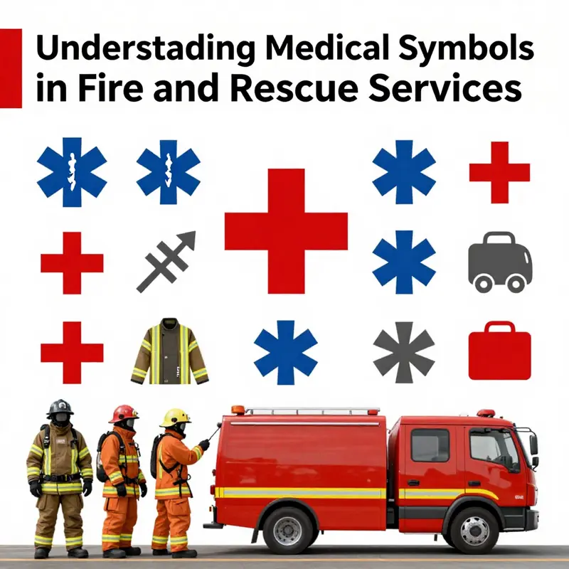
The Star of Life is central to prehospital care. It is a blue, six-pointed star bearing a serpent-wrapped staff. Each arm of the star symbolizes a function of emergency medical services. Those functions include detection, reporting, response, on-scene care, care in transit, and facility care. Fire departments that provide EMS often display the Star of Life on apparatus, uniforms, and equipment. Using this symbol signals that trained medical care is available at the scene or in transport.
Equally familiar is the red cross on a white background. This emblem signals general medical assistance. It appears on ambulances, first aid stations, and medical kits. The cross has long international recognition. In multi-agency incidents it helps civilians and responders locate medical supplies quickly. Many events and venues use variations of this sign to mark fixed first aid points and temporary treatment areas. Recent implementations show a trend toward combining the cross with digital identifiers. For example, a large event placed red-and-white cross signs with unique alphanumeric codes at regular intervals. This practice gave dispatchers a fast and precise way to send responders to the correct location.
Another simple, high-contrast marker is the hospital symbol: a white H on a colored field. This icon is used on signage to point toward hospital services and designated treatment centers. When integrated into an incident map or on tactical displays, the H icon tells commanders where definitive care is located. In urban or complex scenes, a clear H helps triage and transport decisions. Using consistent color and placement for the H symbol reduces confusion during mass casualty incidents.
Color coding matters. Traditional emergency colors are blue, red, white, and green. Each carries a different connotation. Blue often denotes urgent medical response, as with the Star of Life. Red calls attention and indicates emergency actions. Green sometimes denotes non-emergency medical services, like wellness centers or clinics. Teams that operate across contexts must guard against color conflicts. For instance, using green to mark a command post could confuse responders who expect green to mean a medical triage area. Choosing a palette that keeps medical symbols distinct from operational symbols improves clarity.
Alphanumeric identifiers are an increasingly important layer of classification. These short, machine-readable codes pair with visual symbols to provide precision. A code like CDB3FE01 can identify an exact booth, gate, or stairwell in a large site. When linked to an incident management system, those codes reduce the time spent locating incidents. They also create a simple channel for civilians with limited situational awareness. Someone who cannot describe a location clearly can read or photograph a nearby code and relay it to a dispatcher. This hybrid approach—visual emblem plus location code—shortens response intervals and reduces navigational errors.
Local and international norms shape symbol use. Some emblems, like the Star of Life, enjoy broad acceptance. Others, such as the caduceus or certain historic medical signs, suffer from mixed recognition. The caduceus is often avoided in EMS contexts because of potential confusion with non-emergency medical professions. Fire and rescue services prefer unambiguous signs that direct immediate action. That preference drives standardization within agencies. It also influences procurement and training. Teams teach responders to read and trust a narrow set of symbols rather than a wide, inconsistent palette.
Practical placement strategies help the symbols function under pressure. High-contrast signs mounted at eye level perform best in crowded scenes. Reflective materials and luminescent paint extend visibility into low light. On vehicles, a compact set of symbols on the rear and sides communicates both affiliation and capability. On uniforms, chest and shoulder patches provide quick visual cues during chaotic operations. Equipment caches and kits are labeled clearly so non-medical rescuers can find basic supplies in seconds. Redundancy is useful. Pairing a symbol with an alphanumeric code, text label, or color band covers gaps caused by language or familiarity differences.
Classification extends to internal records as well. Agencies often maintain symbol libraries within their asset management systems. Each icon receives metadata: intended meaning, placement guidelines, permitted variants, and file formats. This practice ensures consistent use across printed materials, vehicle liveries, digital displays, and temporary signage. Where incidents cross jurisdictions, these libraries facilitate rapid harmonization. A mutual aid agreement can include a shared symbol set, reducing miscommunication during joint operations.
Training ties the visual language to action. Firefighters and paramedics rehearse with the same symbols they encounter in real events. Simulations include signage, color bands, and codes. Dispatchers learn to accept alphanumeric identifiers from callers. Incident managers practice mapping those codes to responder routes. Regular training reduces hesitation and error. When every team member understands the visual shorthand, the entire response network moves faster and with fewer misunderstandings.
Accessibility and cultural context deserve attention. Symbols must be legible to people with impaired vision, language barriers, or different symbolic conventions. Using pictograms paired with short, multilingual labels improves comprehension. High-contrast color choices help those with color vision deficiencies. In international settings, agencies might replace text-heavy signs with pure icons and codes. Doing so preserves meaning across languages. Event managers and planners should test signage with diverse user groups before deployment.
Technology complements traditional marks. Digital mapping, QR codes, and beacon-based systems can augment static symbols. A responder scanning a code can receive GPS coordinates, hazard notes, and the nearest medical resource. But technology should not replace core emblems. Power failures, device malfunctions, or lack of connectivity make simple, durable symbols a necessary baseline. The most resilient systems layer both approaches: physical emblems for universal recognition, and digital identifiers for precision and data sharing.
Finally, graphic quality and licensing matter for operational use. High-resolution vector graphics ensure legibility at any size. Vectors scale cleanly for vehicle wraps, signage, or helmet decals. For agencies that need assets free of royalty concerns, a library of permissively licensed vectors is useful. Designers can adapt those files to local standards without creating legal complications. For teams planning or updating their visual resources, accessing such libraries speeds production and maintains professional standards. An example resource for royalty-free rescue and medical vectors is available online at: https://www.freepik.com/vectors/rescue-symbol.
Fire and rescue teams do not invent medical symbols. They adopt, adapt, and combine established icons to match mission needs. The effective classification of those symbols depends on clarity, consistency, and context. When teams pair clear emblems with precise alphanumeric identifiers, they produce a visual system that guides action, reduces mistakes, and saves time. Training, accessible design, and robust asset libraries keep that system working under stress. Finally, technology augments but does not replace the core, universal symbols that rescue teams rely on to communicate care at the scene. For perspective on how technological change shapes operational decisions, see this discussion on the impact of technology on fire department leadership: impact of technology on fire department leadership.
null
null
Recognizing the Need for Specific Symbolism in Fire and Rescue Communication
Symbols matter in emergencies because they reduce cognitive load under stress, enabling responders to read a scene quickly and act decisively. In practice, the language of symbols must be understood across agencies, languages, and levels of training. When responders arrive on a chaotic scene, the first task is to locate the nearest aid, determine hazards, identify victims, and coordinate movement of people and equipment. In fire and rescue contexts, the medical component often rides alongside, or inside, a broader service identity. There is no single universal medical symbol reserved exclusively for fire and rescue. Instead, the most universal EMS symbol remains the Star of Life, a blue six pointed star that encases six functions of care: detection, reporting, response, on scene care, care in transit, and facility care. Yet this emblem does not exist in isolation; it is embedded in a network of markings that include the fire department emblem or the fire engine logo and the signage used on ambulances and hospitals. In many jurisdictions, when a fire service provides medical care, they carry the Star of Life in addition to their own branding, signaling to bystanders and other responders that medical treatment is underway even as the scene is managed for firefighting and rescue. This dual signaling is a practical compromise, reflecting a service identity that is both emergency medical system and fire and rescue operation; the result is a combined language that can still lead to confusion if the symbols are not harmonized. The absence of a distinct medical symbol for fire and rescue is not a mere curiosity; it has real consequences. The fire service, with its own logos, may attract attention to identity and authority rather than to the urgent medical need at hand. In a multiagency incident, where fire, EMS, police, and sometimes civilian volunteers converge, a lack of a clear, standardized set of symbols risks delays in locating the right resources. Interoperability depends on shared visual cues that cross borders and disciplines. This is where the work of standardization assumes a practical and urgent role, extending beyond aesthetic preference into the realm of life safety. In this sense, the case for specific symbolism is less about style and more about timely comprehension. The United Nations Office for the Coordination of Humanitarian Affairs has repeatedly highlighted the importance of harmonized visual communication in disaster response, noting that common pictorial language accelerates decision making and reduces the chance for misinterpretation when normal channels are stressed or disrupted. See the guidance on humanitarian mapping and emergency signage for more context. The practical implication for fire and rescue is simple: when you need to classify medical symbols used in fire and rescue, you are not choosing a decoration; you are selecting a functional code that must endure high temperature, low light, noise, and fatigue, while remaining culturally neutral and instantly recognizable. A central criterion for any such coding system is clarity under pressure. This means symbols must be distinguishable at a glance and legible at a distance, with consistent color, shape, and polarity that do not rely on texture or subtle shading. In high-stress environments, color associations and geometric shapes carry notice more quickly than text, which is often indecipherable when the operator is wearing gloves or the lights are blinking. The ongoing work on user-centric optimization of emergency map symbols emphasizes these principles by testing symbol sets under simulated field conditions and across diverse populations. The goal is not to create a limitless catalog of icons but to assemble a compact, interoperable library where each symbol carries a precise meaning with minimal chance of overlap or misinterpretation. In the contamination scenario used as a stress test, responders must instantly recognize areas that are hazardous, zones that require evacuation, safe passage routes, and the location of victims waiting for extraction or medical care. When symbols succeed, they do more than convey information; they enable rapid triage, reduce the chance of wrong turns, and free cognitive bandwidth for decision making that can mean the difference between life and death. In that context, the six classic functions represented by the Star of Life have a practical corollary in symbol taxonomy. Detection and Reporting become pre-emergency cues, marking the presence of a hazard or the existence of an incident in a way that is legible to all responders, even those arriving from different regions or speaking different languages. The Dispatch function is often encoded in the way a map or a panel signals the operational unit deployed to the scene; it is not a separate icon so much as a reserved space on the communications platform where status can be updated without ambiguity. On-Scene Care and Care in Transit translate into symbols that mark treatment areas, life-saving devices, and patient condition indicators, all of which must be visible to the paramedics and to the transport units that will carry the patient to care facilities. Finally, Facility Care emphasizes the handover to hospital teams, and the accompanying symbols should guide where the patient will be received and in what condition, ensuring continuity of care. Practically, this means that any symbol used to indicate medical action on a fire ground or in a rescue operation must be legible from multiple angles and under various lighting conditions, must avoid conflation with industrial or structural icons, and should be compatible with equipment in the field, from street signage to ambulance livery. Beyond the Star of Life, there is a separate, equally important thread in the symbolism of fire and rescue: the concept of priority service. In some signage and policy contexts, the term Fire Priority Service denotes a designated channel for fire and rescue personnel to access medical care, shelter, or evacuation resources with minimal delay. This is not a medical symbol per se but a service designation that changes how responders move through a system during a crisis. The existence of this concept reminds us that symbolism in public safety is never purely visual; it intersects with procedural rules, access rights, and the choreography of a response. A well-designed communication system integrates these dimensions—visual icons, color codes, and priority pathways—so that responders can transition from one phase of an incident to the next with confidence. In practice, teams that design these systems must account for how symbols will appear on machinery, on banners, on portable signage, and on the screens of incident command software. They must ensure that the same symbol does not carry multiple conflicting meanings when shown at night, in rain, or in smoke. The push toward harmonized visuals is therefore not a cosmetic exercise but a governance question. If agencies agree on a shared visual language, they can train toward a common lexicon, reducing the time required to interpret maps, infographics, or on-scene boards. The work is most effective when it is user centered: symbols tested with frontline responders, nurses, EMTs, dispatchers, and even laypeople who might encounter an emergency. Cultural neutrality is a critical objective. While no symbol can be completely universal, designers strive to minimize cultural biases in shapes and colors, ensuring that a symbol that communicates danger in one country is not interpreted as safety in another. The literature on humanitarian mapping from OCHA provides a framework for this harmonization, urging practitioners to adopt standardized icons whenever possible and to document deviations when they must be adapted to local contexts. In line with that guidance, the classification of symbols for fire and rescue must therefore be anchored in a core set of medical and emergency indicators, while preserving the flexibility to address local realities. The practical payoff of these design choices becomes evident on the ground. When a specific area has been contaminated, a uniform set of hazard icons, evacuation routes, decontamination points, and victim locations becomes a map’s backbone. Without these standard marks, responders may waste critical minutes trying to interpret a hodgepodge of shapes drawn from memory or tradition. The risk is not simply inefficiency; it is increased exposure to hazards and greater potential for miscommunication when teams converge from different agencies. The research on emergency map symbol optimization argues for a deliberate balance between intuitiveness and precision. It suggests that symbols should be legible at the scale of a typical incident map, resilient to color-blind viewers, and compatible with both digital displays and printed sheets that may weather adverse conditions. These requirements push designers toward crisp contours, high-contrast color combinations, and consistent symbolic grammar that aligns with the Star of Life and with the fire service’s own markings, so the overall picture remains coherent even as agencies contribute their own resources to the response. In the conversations around symbol classification, several practical steps emerge. First, agencies can begin by cataloging which symbols they already deploy on uniforms, vehicles, and incident boards, then map those tokens to functional meanings. Second, a cross-disciplinary panel can draft a minimal symbolic alphabet anchored in the six EMS functions and supplemented by a few clearly defined hazard indicators and service designators. Third, field testing in simulated exercises or live drills can reveal where symbols collide or cause misinterpretation, allowing teams to prune the catalog for clarity. Fourth, publishing a concise guide—one that pairs symbol shapes with short, standardized captions in multiple languages—helps spread best practices and accelerates training. Importantly, this work does not erase local identity or the recognizability of a region’s fire and rescue branding; it simply layers a universal layer of medical symbolism over the existing signs so that all responders know where to go and what to do, even when local logos are visible and the scene is crowded with equipment. These considerations also intersect with capacity-building and accessibility. The design of symbols must accommodate responders with varying degrees of literacy and language proficiency, as well as volunteers who may not be fluent in the dominant tongue of the area. In such cases, the reliance on iconic shapes and color cues becomes even more critical. The aim is to reduce cognitive load, not to overwhelm it with novelty. A thoughtful symbol library invites ongoing training, encourages consistent use, and can be rolled out with a simple set of guidelines that fit into existing incident command protocols. The ultimate objective is to enable faster recognition and faster action, while reducing the need for verbal explanations in the heat of a crisis. This is the point at which the question of symbol classification moves from theoretical debate into practical policy: how to codify a visual system that stays legible when smoke, rain, and fatigue wear down a responder’s senses. As designers and policymakers consider next steps, the invitation is to imagine a future in which fire and rescue symbols are not merely signs but reliable guides that help people stay safe. This is not a call to abandon existing branding but a plea to weave a universal medical symbol layer through it. The Star of Life can continue to mark EMS actions, while the fire department emblem can signal brand and jurisdiction, and the combined set of hazard icons can warn, direct, and protect. When this layered approach works, a person entering a scene—whether a nurse, a firefighter, or a citizen volunteer—reads the map not as a patchwork of separate languages but as a single, coherent code that speaks across divisions. The discipline of symbol design, grounded in evidence and tested under pressure, makes this possible. It is a quiet but powerful shift, one that requires collaboration, shared standards, and sustained commitment to training. It also requires attention to what it means to classify medical symbols in contexts as diverse as urban emergency response and rural, resource-limited environments, where signage may be the only guide to safety for miles of terrain. In those realities, even a small improvement in symbol clarity can reduce hesitation, cut response times, and save lives. For readers who want to explore the broader conversations around this topic, there is a sense that the field is evolving toward an integrative approach. Innovation Museum Transforming Fire Services has become one of the spaces where practitioners and researchers examine how symbol libraries can be curated, tested, and deployed. The discussions there emphasize that symbol design is not a finish line but a process of iterative refinement, guided by field feedback, performance metrics, and the evolving needs of responders who operate in changing environments. This chapter, while focused on the specifics of how to classify medical symbols within fire and rescue, sits within that larger arc of professional learning, standard-setting, and practical innovation. The goal is not to isolate a single symbol but to harmonize the way information travels across the incident ground so that a person on the street can look at a sign and instantly know what to do, even if they do not speak the local language. The story of symbol recognition on the fire ground is really a story about trust and speed, about how the right sign at the right moment turns chaos into coordinated action, and about how a unified symbolic language can become a shared language for life itself. External resource: For further guidance on the standards and practices that drive harmonized visual communication in disaster response, see https://www.unocha.org/.
Final thoughts
In closing, understanding the medical symbols associated with fire and rescue operations is essential for effective communication during emergencies. The Star of Life and other medical symbols serve not only as identifiers of the medical services provided but also as reminders of the critical functions these teams perform. As community members and emergency personnel become more familiar with these symbols, the potential for improved collaboration and responsiveness in crisis situations increases. Together, we can foster a safer community where all individuals are aware of the vital roles played by our fire and rescue teams.